
Your cart is empty
Start shopping to add items to your cart
Every logo, color, type style, and product image we use across the site, social, packaging, and partner outreach — in one place. Bookmark this page.
Six lockups for every context. Always maintain clear space (at least the height of the avocado half) around the mark.

App icon, favicon, social avatar, watermark. Square 1:1 ratio.
Site header, email signatures, product packaging. Horizontal layout with the avocado dot.

Favicon at small sizes, partner badges, certification marks. Circular.
iOS / Android / PWA home screen. Full-bleed with avocado, no wordmark.
Dark mode UI, dark backgrounds, video end-cards. Cream on deep green.
Marketing materials, certifications, anniversary seals. Vintage feel.
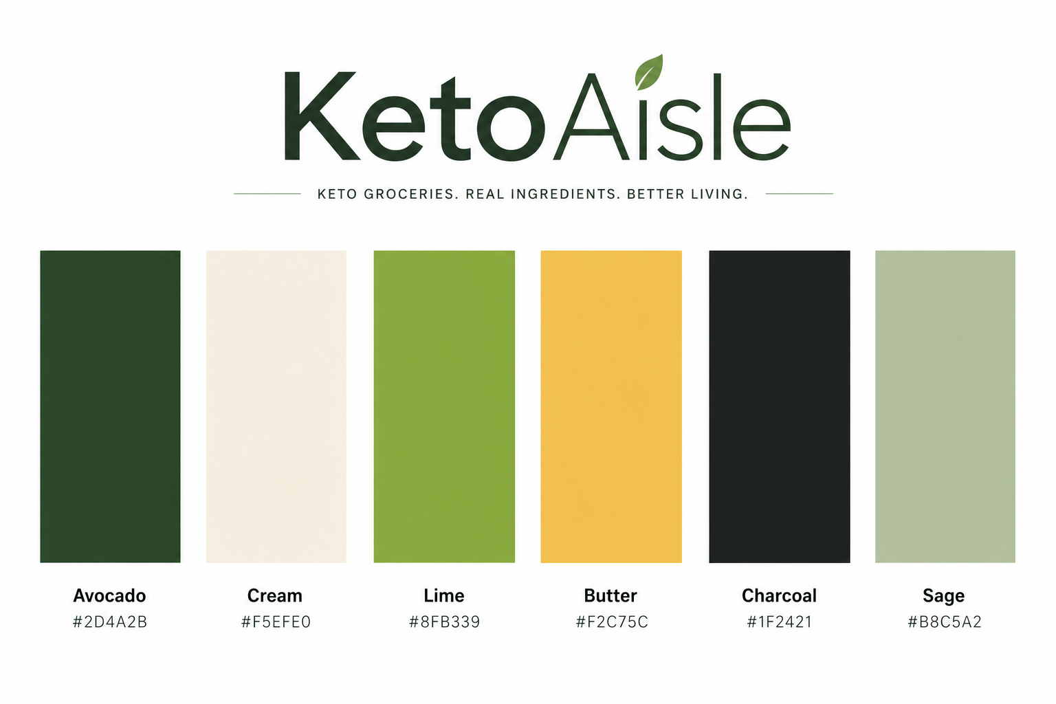
Six brand colors. Avocado and Cream are the foundation; the other four are accents. Never introduce a color outside this set without discussion.
#2D4A2B
Avocado
Primary brand color. Deep forest green. Use for primary buttons, headings, logo on light backgrounds.
#F5EFE0
Cream
Background surface. Warm off-white, easier on eyes than pure white. Default page background.
#8FB339
Lime
Vibrant accent. For badges, highlights, hover states, fresh-produce imagery overlays.
#F2C75C
Butter
Warm secondary. Sale tags, fat-content badges, "limited time" indicators, premium tier.
#1F2421
Charcoal
Body text. Near-black with green undertone. Replaces harsh #000 for warmer reading.
#B8C5A2
Sage
Muted accent. Backgrounds, dividers, secondary CTAs, gentle "calm" affordances.
Two type families. Plus Jakarta Sans for display headlines, Inter for body. JetBrains Mono for product SKUs and order numbers.
Display / Headings
Plus Jakarta
Geometric, friendly, modern. Used for h1/h2 headings, product names, CTAs, prices. Weights 600-800. Tracking tight on display, normal on body.
A B C D E F G H I J K L M
a b c d e f g h i j k l m
Body / UI
Inter
Workhorse sans-serif. Used for body copy, buttons, forms, navigation, product descriptions. Optimized for screen reading. Weights 400-700.
A B C D E F G H I J K L M
a b c d e f g h i j k l m
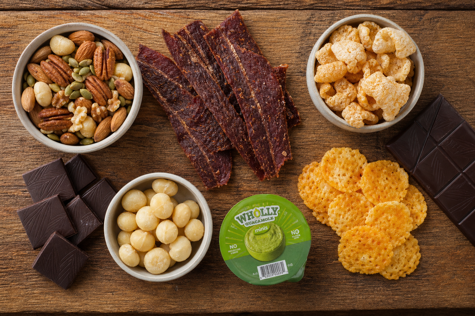
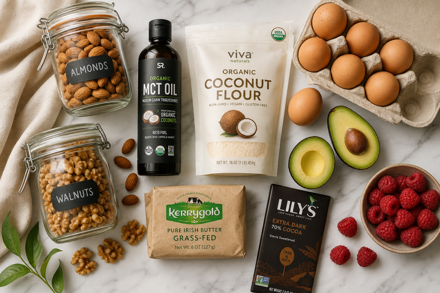
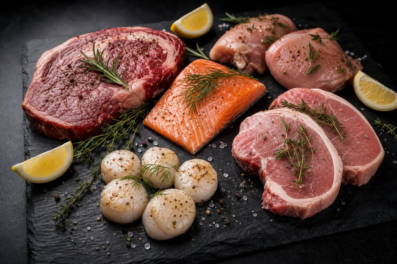
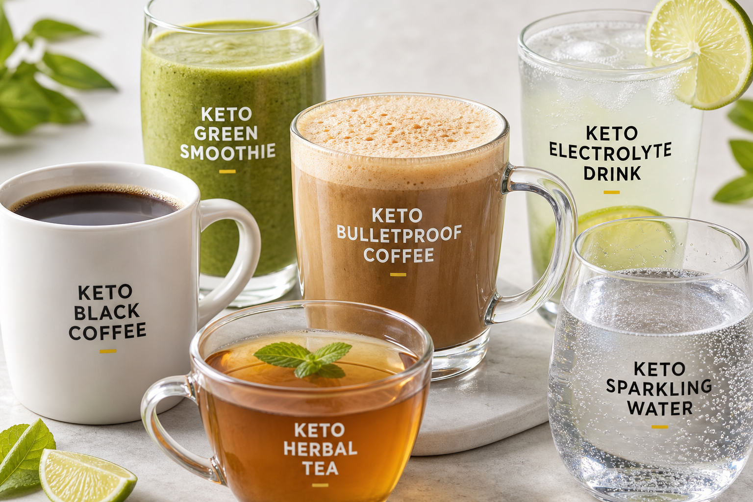
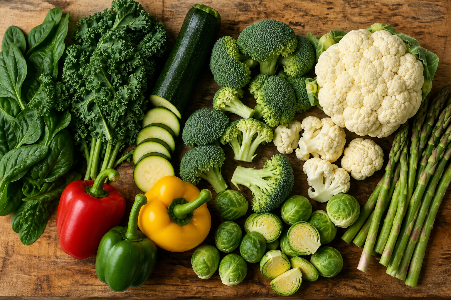
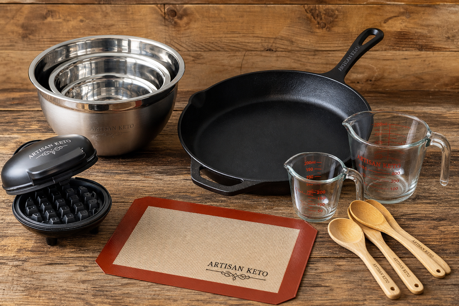
Editorial flat-lay and product photography. Warm, natural light. Wood and marble surfaces. Never use stock keto-diet imagery (scrambled eggs with bacon on a plate) — we shoot the actual products.
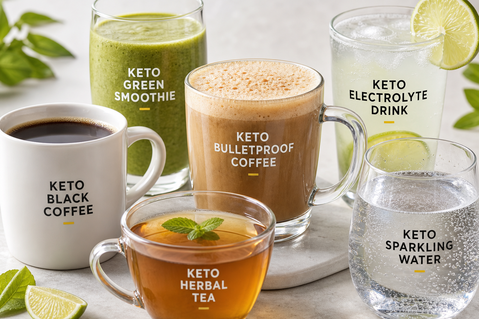
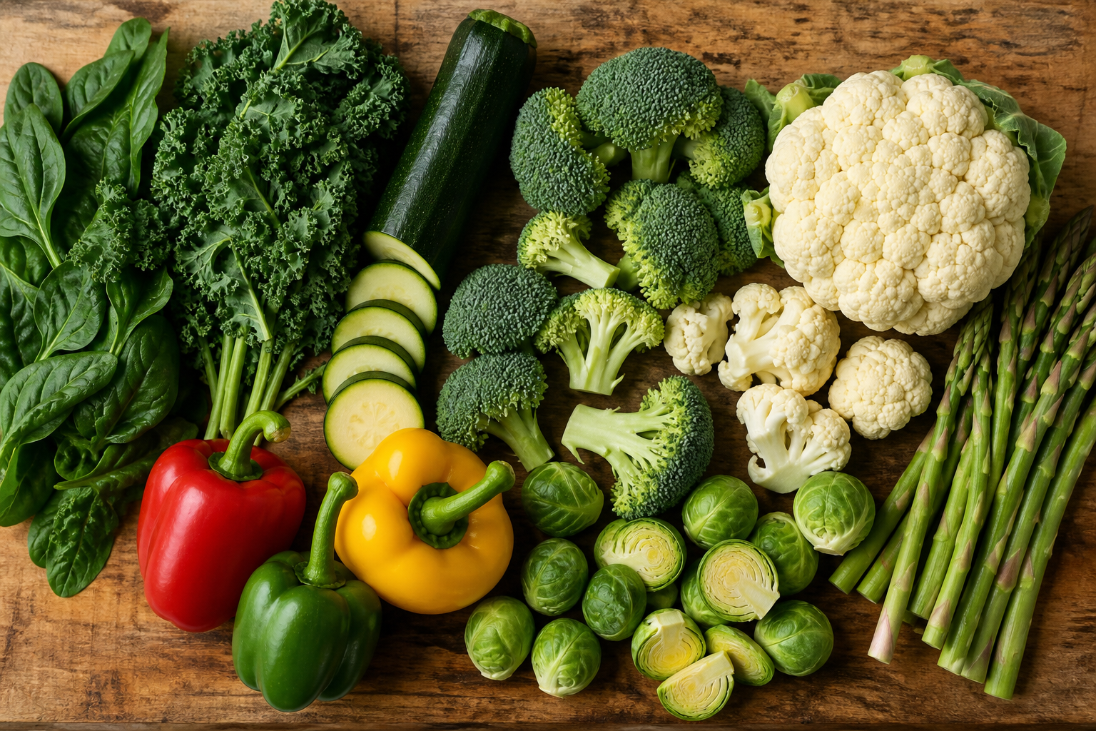
Lifestyle hero shots for landing pages, ad campaigns, blog post headers. Three core scenes: produce, beverages, pantry.
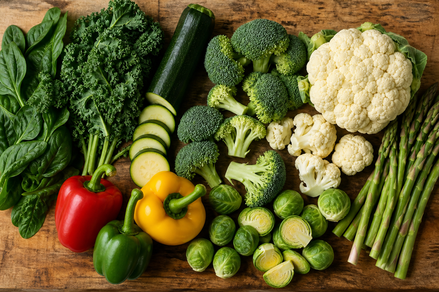
Vegetables, fresh, kitchen, real-food.
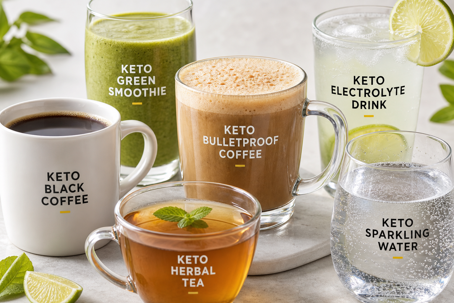
Coffee, bulletproof, electrolyte, sparkling water.
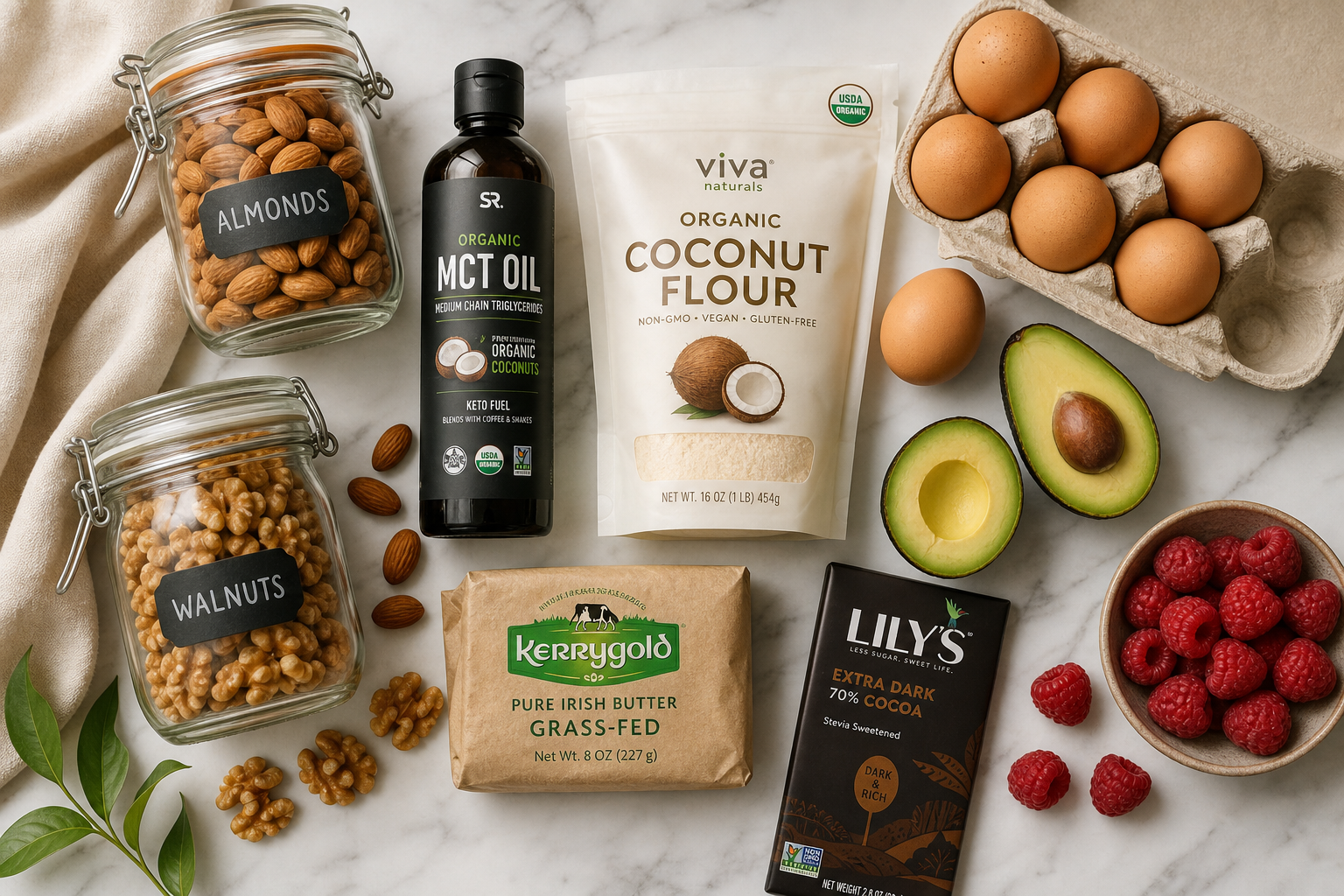
Pantry staples, almond flour, MCT oil, butter.
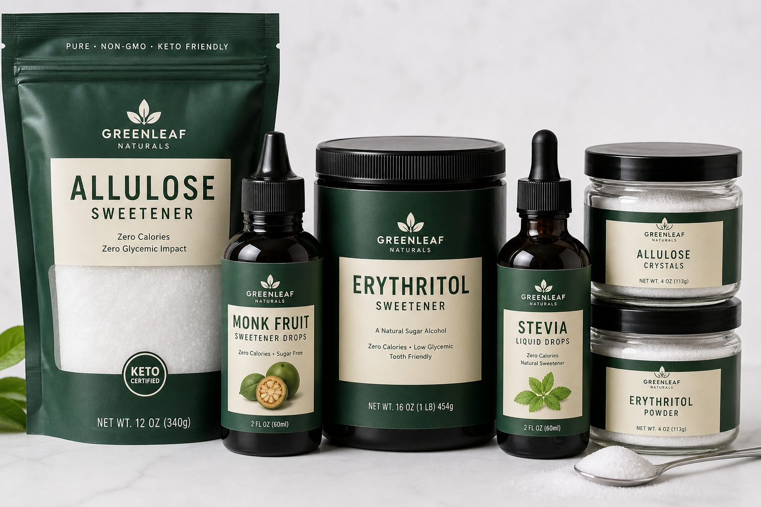
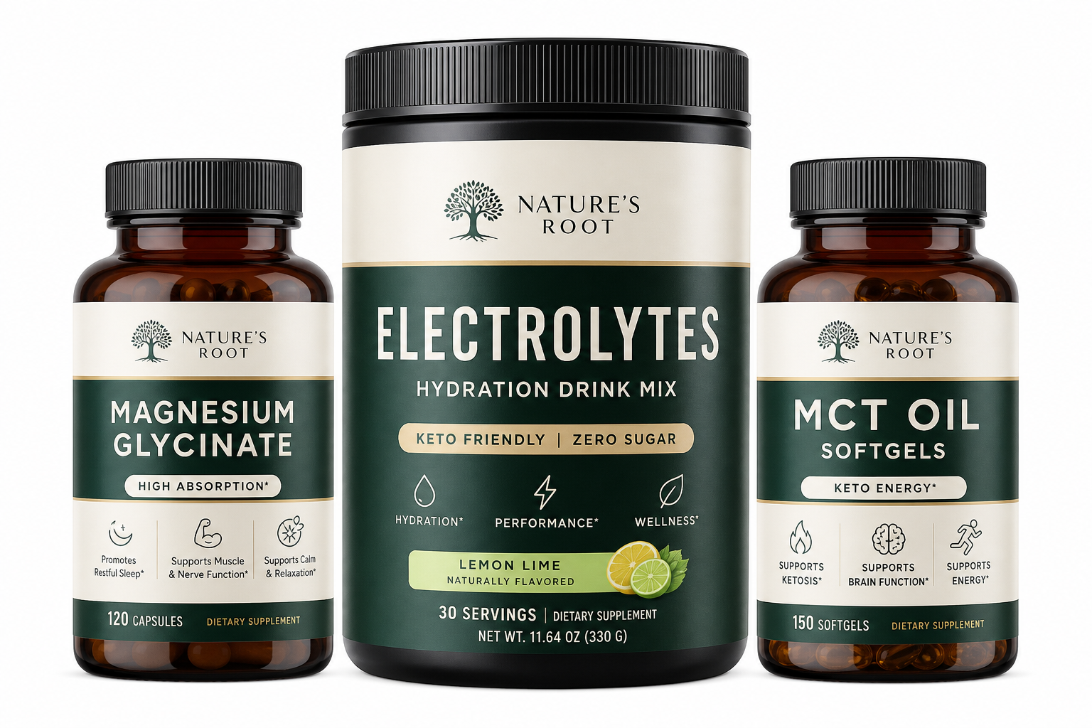
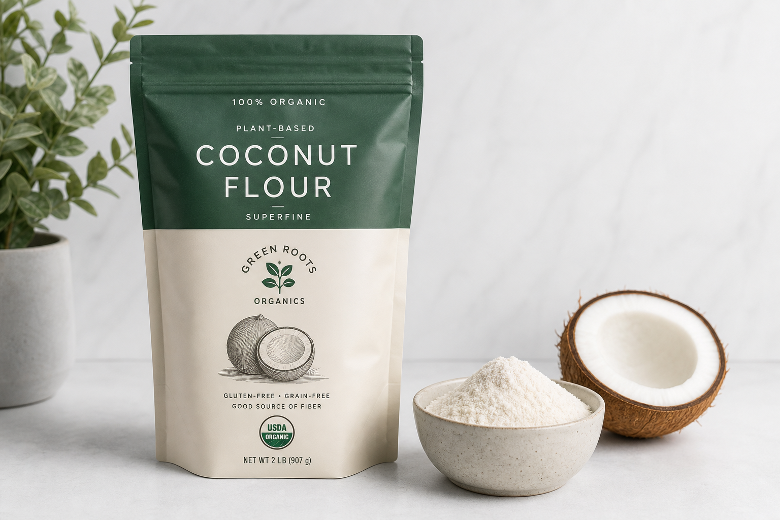
Product cards, detail pages, cart, and checkout. Square 1:1 ratio, clean white surface, minimalist packaging in deep green and cream.
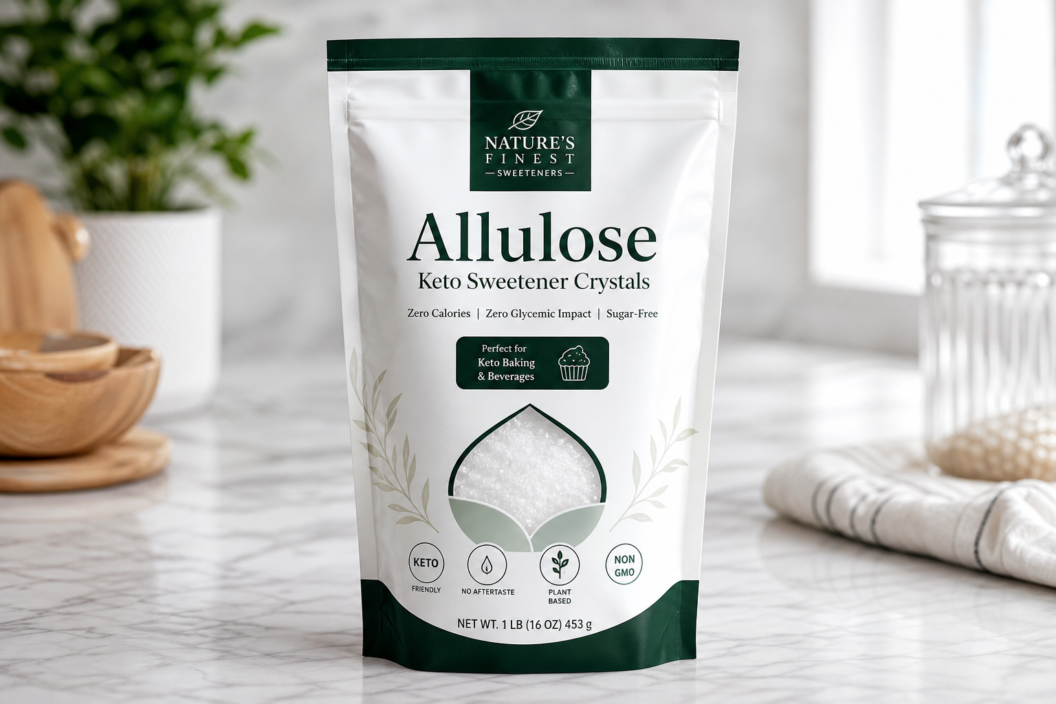
Allulose
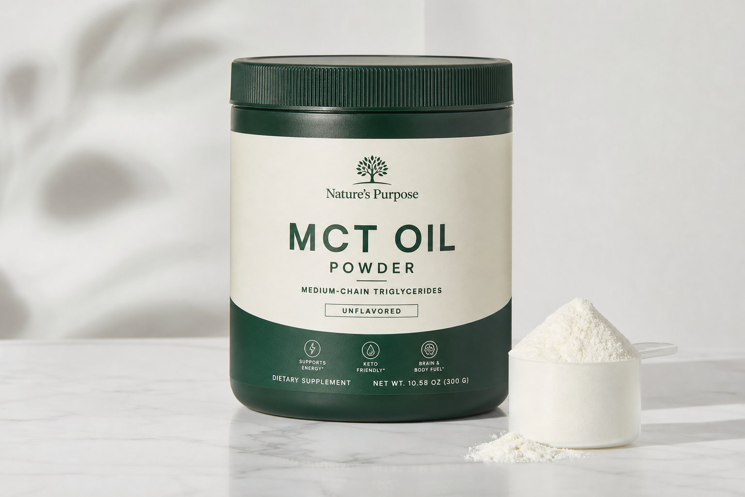
MCT Powder
Whey Isolate
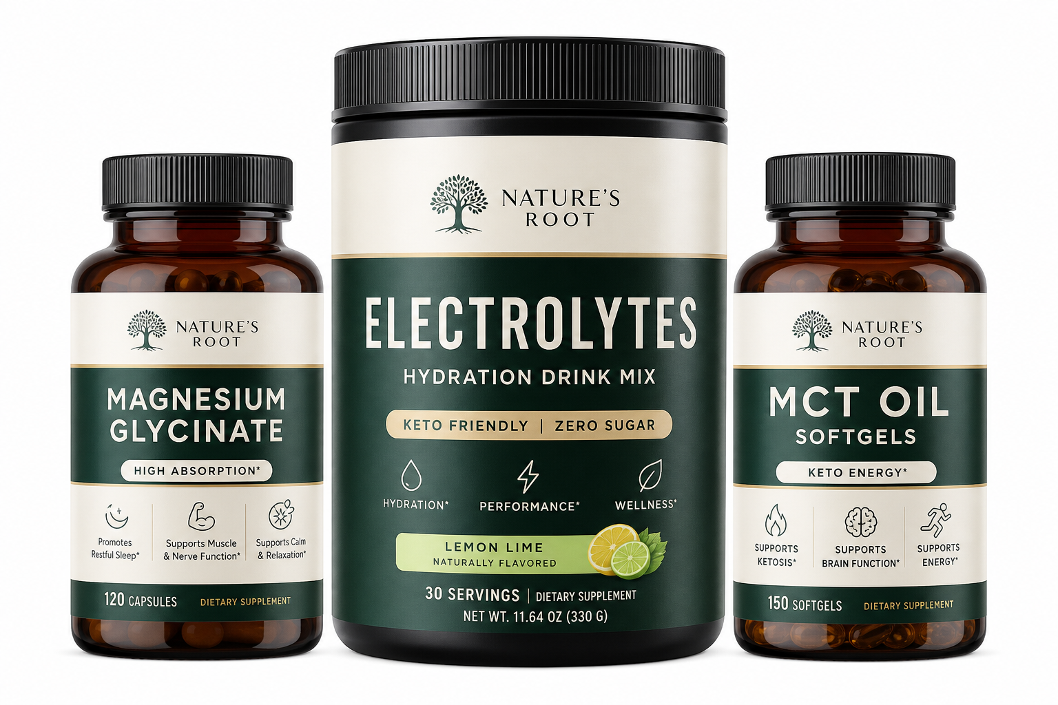
Electrolytes
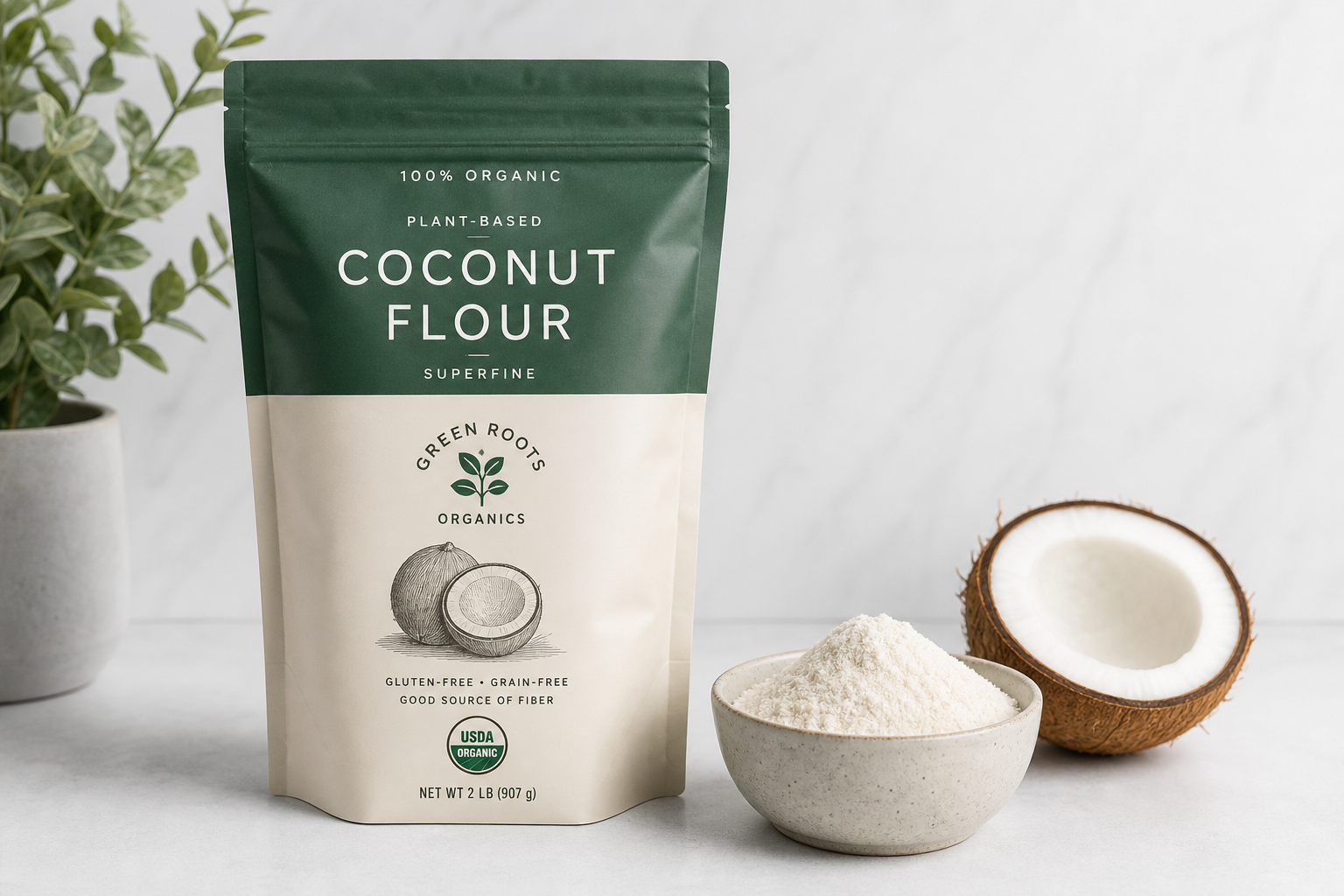
Coconut Flour
Almond Flour
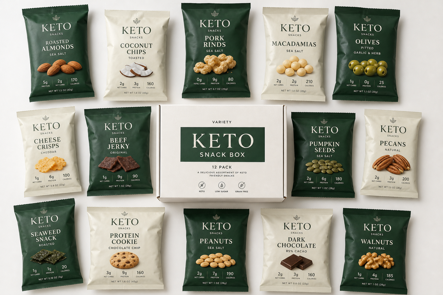
Snack Box
Collagen
Beef Sticks
Sparkling Water
Keto Ketchup
Cast Iron Skillet
Merch model
We organize the catalog three ways: by category (what it is), by brand (who made it), and by goal (what you're trying to do). The goal view is the merchandising angle — beginners, athletes, and people managing blood sugar all need different things. We lead with goal in marketing copy because that's how people think about keto.
Just starting keto? These are the staples that make week one survivable: easy chaffles, low-carb snacks, an electrolyte that doesn't taste like regret.
6 SKUs · $9-25 each
Keto for performance? You need fast MCT energy, pre-workout electrolytes, and high-protein recovery. These are the picks the CrossFit keto crowd actually buys.
4 SKUs · $25-65 each
Managing glucose? Zero sugar, low net carbs, no maltitol, no dextrose. Every pick here is verified by nutrition label, not just "keto-friendly" marketing copy.
4 SKUs · $8-30 each
Goal-based filtering is staged for v2 — the links currently load the full shop with a query string we can route to. The catalog is the same; the framing changes.
We sound like a friend who has actually been keto for years, not a marketing department. Direct, no-BS, slightly opinionated. We say "net carbs" not "carbohydrate net weight" because real keto people use the short form. We don't shame people for "cheat meals" — we're not the food police.
We say
"If it has more than 5g net carbs per serving, it's not a snack, it's a meal."
We don't say
"Keto-friendly options that may complement a balanced low-carbohydrate lifestyle."